Start With the House, Not the Paver Display
Choosing a paver color sounds simple until you see an entire display wall of warm grays, cool grays, sandy tans, charcoals, and multi-color blends. A small sample can look perfect by itself and still feel disconnected once it covers a full patio. The most reliable way to narrow the choices is to begin with what is already permanent: your brick or siding, mortar, roof, window trim, stonework, and the larger character of the house.
That approach lines up with Belgard’s outdoor design guidance, which recommends considering the architecture, landscape, size, and function of the space before choosing a hardscape product. In other words, the patio should feel like part of the property rather than a beautiful sample that happened to land in the backyard.
Begin by identifying the undertones in the fixed materials. Traditional red brick may lean orange, brown, burgundy, or even slightly purple. Mortar can be creamy, gray, or bright white. A charcoal roof and black window frames introduce a cool, dark note even when the brick is warm. You do not need every surface to match. You need the colors to relate.
- For red or brown brick: look first at warm greige, muted taupe, weathered stone, and soft charcoal. These can echo the mortar or the darker flecks in the brick without adding another loud red.
- For white or painted brick: warm gray, limestone, and restrained tan blends can keep the patio from feeling stark. A darker border may connect with black or bronze trim.
- For natural stone: pull one quiet tone from the stone instead of trying to reproduce every variation. Let texture provide the rest of the interest.
- For a modern exterior: a simpler tone-on-tone palette and larger paver format often feels calmer than a busy blend.
There is room for personality, but coordination comes before trend. Belgard’s color and tone overview makes the same practical point: choose a scheme that complements the existing structures. That still leaves plenty of freedom to decide whether the patio should blend quietly into the home or create a measured contrast.
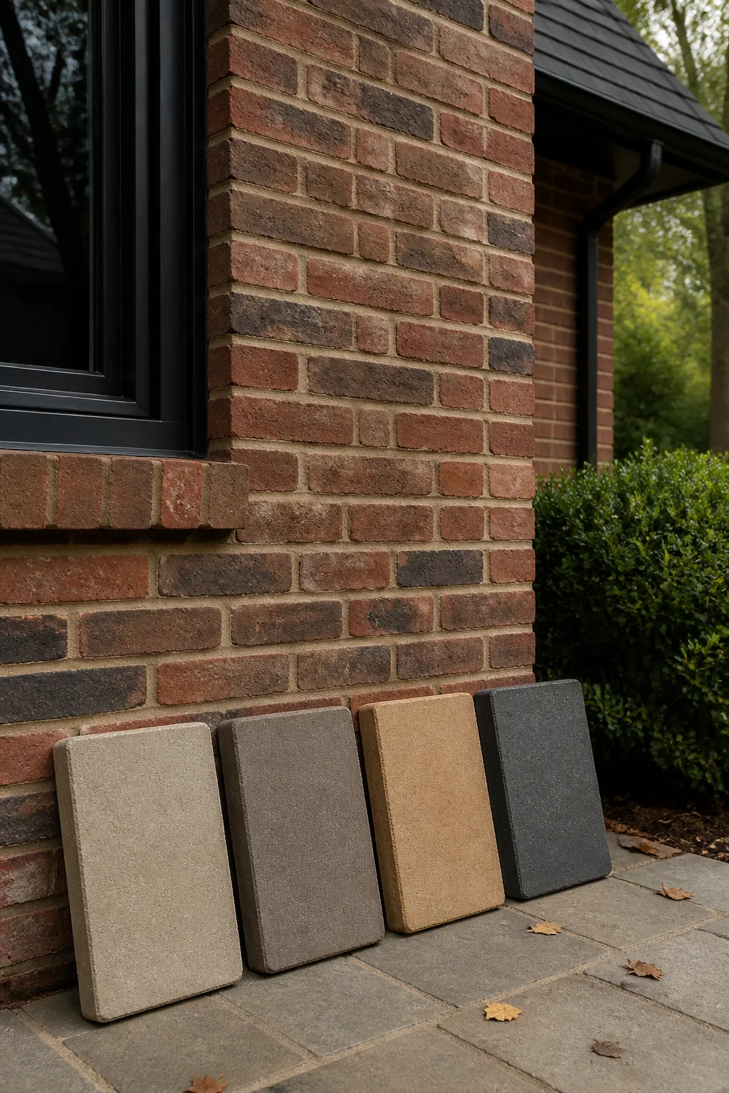
How to Choose a Paver Color in Real Upstate Light
Digital catalogs are useful for building a short list, but they are not the final decision. The current Belgard regional catalog notes that products contain natural materials, colors may vary from printed representations, and actual samples should be viewed. Tremron’s South Carolina catalog gives similar advice. That matters because a phone screen cannot reproduce the exact blend, surface texture, or way a paver changes across a larger field.
Ask to see full-size samples at your home and place them where the patio will actually go. Compare them next to the brick, a stone foundation, a painted column, or a step—not in the middle of an empty lawn. Look once in the morning, once in the stronger middle-of-day light, and again when the area is shaded. A color that feels pale and quiet at noon can read much richer beside a shaded brick wall in the evening.
It also helps to judge more than one unit. Blended pavers are designed to show variation, so a single piece cannot reveal the balance of the finished surface. If possible, look at several pieces together or a larger display panel. The goal is not to find a perfectly uniform tile. It is to understand the overall color family and the amount of movement you will see once the patio spans hundreds of square feet.
Keep the landscape in the frame, too. Upstate yards are green for much of the year, and many established properties have deep shade, red clay at bed edges, dark mulch, and mature trees. Warm neutrals often sit comfortably in that setting, but the right answer still depends on the house. Current Houzz exterior research reports growing interest in warmer exterior palettes in 2026. Treat that as inspiration, not a command. The best paver color is the one that still makes sense when the trend cycle moves on.
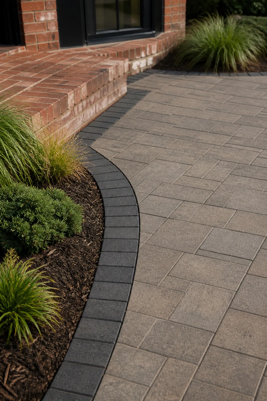
Use Borders, Patterns, and Texture to Connect the Palette
Color does not work alone. The same warm-gray paver can feel traditional in a smaller brick shape, relaxed in a tumbled finish, or modern in a large clean-edged format. That is why we prefer to make color, shape, texture, and pattern decisions together. If you lock in one piece at a time, the final combination can become busier than expected.
A useful rule is to give each choice a job. The field paver covers most of the patio, so it should usually be the calmest part of the palette. A border can pick up the roof, shutters, window frames, or a dark fleck in the brick. A different texture can define a step, walkway transition, or outdoor-room edge without introducing another competing color.
Belgard groups its palette approaches into solid colors, tone-on-tone options, and blends. Each can work when used intentionally. A solid or subtle tone-on-tone field creates a quieter background for furniture and planting. A multi-color blend adds movement and may help bridge several exterior materials. Contrast works best when it is controlled: a charcoal soldier-course border around a warm greige field can connect dark trim to the patio without turning the entire surface dark.
- Repeat one existing color: echo the mortar, roof, trim, or stone rather than inventing a completely separate palette.
- Limit the starring roles: if the brick already has strong variation, let the pavers be quieter. If the house is simple and monochromatic, the patio can carry more texture.
- Check transitions: view the proposed palette where it meets steps, walkways, coping, retaining walls, and doors.
- Plan future features now: an outdoor kitchen, seating wall, or fire feature should be able to join the same material family later.
That final point is easy to miss. A patio is rarely seen by itself once it is furnished and planted. The 2026 Houzz U.S. Outdoor Trends Study found that lounge or seating areas appear in a large majority of renovated outdoor spaces. Your pavers become the floor beneath furniture, planters, shade structures, and lighting. A balanced field color gives those elements room to live without making the space feel unfinished.
Preview the Whole Outdoor Room Before You Commit
Once you have two or three promising palettes, stop looking at individual pieces and picture the complete space. Where will the patio meet the back door? Will a walkway use the same field paver or only repeat the border? Does the proposed outdoor kitchen introduce another stone? Will a future seating wall coordinate with the patio, or force you to start the color decision over?
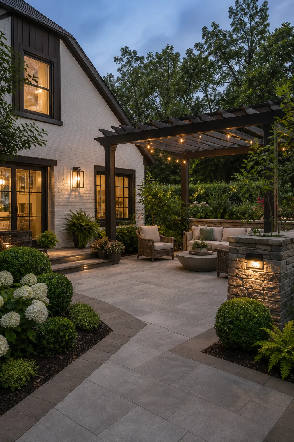
This is where a whole-yard view saves regret. Southern Pavers’ free Design Visualizer lets you explore how a layout and material direction may look in a photo of your own space. It is an idea tool, not a substitute for viewing real samples, but it can help you compare a warm field with a dark border, simplify a busy palette, or see whether the patio feels connected to the house before construction begins.
During an on-site conversation, we can also look at the conditions a visualization cannot fully capture: the real sun and shade, the slope of the yard, drainage, transitions at doors and steps, and the materials available for your project. The paver patio process should bring the practical and visual decisions together. A color choice is only successful when the installation details and the wider hardscape plan support it.
If you are deciding between warm gray, taupe, sandstone, charcoal, or a blend and every sample is starting to look the same, you do not have to make the call from a catalog. Call Joe at (864) 501-6994 or request a free, no-pressure estimate. We will help you compare the palette at your Upstate SC home and build a patio that looks as though it belonged there from the beginning.